

Sharpen: Design Challenges
This is a compilation of design challenges I completed that were generated by Sharpen.design. The purpose of this project is to develop my design thinking and creativity on different industry cases. Enjoy!
Timeline
1 Challenge
in 1 Day
Role
UX/UI Design
Information Architecture
Tools Used
Figma
Adobe Illustrator
Adobe XD
User Flows
I created three user flows that reflected the tasks that the user wanted to accomplish: finding a pre-made flashcard set, leaning the material on-the-go, and testing their knowledge. The process of creating flashcards whether physically or digitally is inherently similar; and so I focused more on the interactions after the user has found a study set. The "happy path" or the most efficient way to the user's goal is highlighted in yellow.
Currently, the only app associated with PepsiCo is the "MyPepsiCo" app for employees. There is no customer engagement in the online realm. Thus, there is an opportunity for PepsiCo to invite old and new customers by adding digital interactions in their physical products. Therefore, the main question is:
Background
"How do I create a usable, lasting, and profitable digital experience from a purely physical products?"
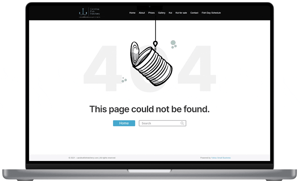
Dynamic elements can add to the personality of the site's 404 page. I chose to animate a fishing rod catching an empty can as a metaphor to the page being empty.
Prototyping
.png)
Design Challenge #1
Design a hologram-paired app for Pepsi

In order to invite customers into using a PepsiCo app, a gamification model can prove useful as a means of both marketing and customer engagement. From research, more than 70% of companies using sales gamification tools, report between 11% to 50% increases in key sales performance metrics. Thus, I will bridge that physical to digital gap through AR technology.
Hypothesis
PepsiMon is an interactive app that utilizes AR. Each Pepsi product will contain a scannable AR section that the user can scan when the app is used. A Pepsimon will appear. The goal of the user is to add to their collection of Pepsimon by buying different varieties of Pepsi products.
User Flow

The high-level navigation pages would include the collection, camera, and profile pages. The camera function will be the main feature for scanning Pepsi products. The collection page will feature all the PepsiMon the user has collected and undiscovered PepsiMon hiding in different Pepsi products. The description page will contain features like taking a selfie for users to engage with their PepsiMon.
Wireframes


Design Challenge #2
Design a fun 404 page for a fish hatchery

For this challenge, I have chosen to rework the 404 page of Carolina Fish Hatchery. Their 404 page is simple. It contains the necessary text and a search bar at the bottom. In this challenge, my goal is to have the user look at more than just a blank page and have options on where to go from there.
Background

In this 404 page I added a home button as well along with the search bar to give the user multiple options. Hopefully, this simple animation can bring a smile to anyone who might encounter this page.
Mockup
Design Challenge #3
Design a homepage for a film festival

There is a multitude of different film festivals on both global and local scales. For this challenge, I chose to refresh the North Carolina Film Festival. I chose this website because it's homepage does not attract or lead to further exploration of the pages. Thus, my focus will be on engagement and web user retainment.
Observations:
-
Top banner takes up 60% of the screen.
-
Lack of CTA buttons to encourage exploration
-
Unappealing visual design
Background

Next, I looked at more commonly known film festivals and anayzed who their target audience are and how they leveraged this information to design an appealing and engaging homepage. From this analysis, I found that there were two main audiences: film makers and film enthusiasts. Based on this information and some assumptions, I created two proto-personas.
Proto-Personas

.png)
I outlined a specific layout for both proto-personas. I separated the homepage sitemaps based on if the film festival is off-season (application period & films not available to general public) and in-season (films entries available to the general public) since the intentions of the film festival vary greatly between both periods.
Sitemaps

In-Season
-
Intention of website is marketing
-
Intended for ticket sales directed to the general public
Off-Season
-
Hero section targeted towrds the two main audiences: film makes and film enjoyers
-
Intentions of website are for film entry recruitment and user engagement.
The first change was with the top navigation page. I reduced its size and included the main navigation in this banner as well. The hero section is the main aspect that viewers will put their initial attention. I created a separate hero section for both in-season and off-season cases. At the bottom, I added a "Recent News" section for viewers to find the relevant information pertaining to the film festival.
Final Design
.png)
In-Season Homepage
-
CTA to buy tickets
-
Focused towards the general public
-
Secondary flow to browse current film entries
-
Hero section contains image of past winner.

Off-Season Homepage
-
CTA focused on both film makers and film enjoyers.
-
For film makers: to apply for the upcoming film festival
-
For film enjoyers: to become a member to enjoy perks


Check out
HIVE
Check out
HealthFlow
©2023 All rights reserved