If I create a consolidated platform that is a "one-stop-shop" for health-conscious individuals to track, manage, and learn about their overall health then this will help users achieve their health and wellbeing goals as they navigate their busy lifestyles.
Specifically, an app that takes into account multiple aspects of health, bringing a holistic approach to educate and support their fitness, nutrition, mental health, general health, and life goals in order to maintain a healthy and balanced lifestyle
Hypothesis
About 86% of US employees working remotely have suffered with burnout and this percentage has been increasing since the pandemic. Despite this, only 48% of employers offer their employees wellness programs, causing people to take managing their health into their own hands. As there are about 300,000+ different health mobile apps available since 2020, finding the right app/s is no easy feat.
Context
How do I keep track of my overall health when I'm on the go or working from home?
Problem
Value Proposition
HealthFlow is a holistic app
Tracking different health aspects and their relation with one another can help promote behavioral change
Pain Point
.png)
Hard to manage multiple apps all at once
Users find it difficult to keep accountable if managing their health with multiple apps
Opportunity
There is a gap in the market
Leading apps only focus on one or two aspects of health

HealthFlow
HealthFlow is a health companion that empowers individuals with busy lifestyles to track their health, build healthier habits, and promote better life quality in order to bring a healthy balance back into their lives.
Timeline
7 Months
Role
UX/UI, User Research & Testing, Information Architecture
Tools Used
Draw.io
OptimalSort
Figma
Goal
To help users manage all aspects of their overall health in a singular consolidated app.
.png)
User Survey
.png)
User Interviews
.png)
There are already a ton of different health apps in the market with more being added each day. I conducted a SWOT analysis, user surveys, and interviews to see the current health app market and how people are interacting with the health app landscape. My biggest question was.. How can my app provide value in a different and unique means? I noticed that apps like BetterMe and MyFitnessPal only focus on one to two aspects of health. None provided any feature to showcase how each aspect interacts with one another.
Competitive Analysis
Discovery
I enumerated what the steps the persona would need to accomplish their goals. I visualized the flow and navigation of the app through the lens of the user. I wanted to highlight the core functions of the app: prepare, track, understand, and learn. I then ideated on how these functions would materialize. Immediately, a tracker was the most prominent solution but my main concern was that there is already a multitude of health trackers in the market, what would be the differentiator?

User Journey
I looked at one of the core functions of the app which is to track the user’s health. So instead of one tracker, I thought of an ecosystem of trackers that talked to each other in a consolidated place through a Dashboard. I outlined the user flow for both the first-time use and subsequent use scenarios. Once a user has added a tracker into the dashboard, then the flow for updating that specific tracker is much shorter as seen in the 2nd flow in orange
User Flow
.png)
Task Flow
Entry Point: Open app
Success Criteria: Log exercise and meals to see net calories
First Time Use:
-
Open the app
-
Log-in / Sign-up
-
Dashboard (Homepage)
-
Select "Add"
-
Select "Add Trackers"
-
Select "Calorie Tracker"
-
Choose "Add to Dashboard"
-
Log Exercise or Meals
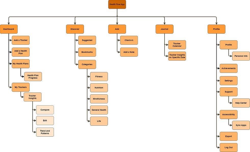
This is the second version of my sitemap after creating the initial architecture. I tested the first sitemap with cardsorting to confirm the intuitiveness and logic of the high-level navigation pages. The users' end goals became the driver for determining the main functionalities of the app which are: tracking health, getting insights, browsing resources.
_drawio.png)
Sitemap
Ideation
Key Features for Designs
Receive a customized plan
An onboarding experience to learn about the users' current health goals for a personalized experience.
Tracking in one place
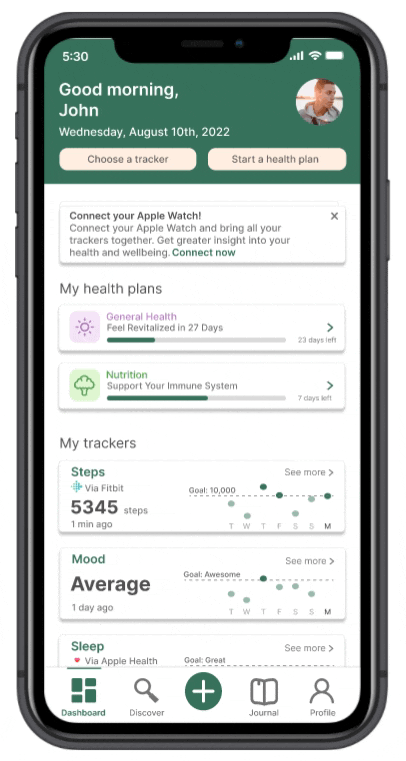
A dashboard as the central hub of information to manage all your health trackers
Get health insights
A place to find patterns and correlations between different health aspect you're tracking
Health resources anytime
A health library filled with resources for every aspect of your health
%201.png)


From sketch to screen
There were three rounds of iterations.
-
1st iteration: Sketched wireframes
-
2nd iteration: Digitized wireframes
-
3rd iteration: After two rounds of usability testing
"I thought it was a to-do list app" and just general confusion were the main takeaways from the 1st usability test. And so I started to think: “Where can I find opportunities to decrease the steps in the user flow?” “Are these features what I want or what the user wants?” I reorganized the sitemap and I integrated Insights into the trackers themselves, which in turn decreased the number of steps for two core user flows. I also added an app compatibility function so users can integrate health apps like FitBit or Apple Watch. Finally, I did an unmoderated usability test to confirm the second sitemap.


%201.png)


Iteration 3

%201.png)

Focusing on a mobile-first design, I started to create wireframes of the high-level navigation screens using pen and paper focused on the core features which are the Onboarding, Dashboard for tracking health, Insights for learning patterns, and Discover for browsing resources.


Iteration 1
I digitized the designs in Figma and I had two main goals: how the Dashboard can be the central hub of information and how to visualize the insights from these trackers. During this time, I realized I was solving too many problems at once and this was clearly apparent in the upcoming usability test.

%201%20(2).png)

%201.png)
%201.png)

Iteration 2
Design
UI Kit
A style guide was created to ensure that the quality and designs of HealthFlow remain consistent over time. The important features of the app have a lot of data visualization elements, images, and illustrations and so I wanted to keep the UI and color scheme simple yet intentional.

.png)
.png)
.png)
.png)
.png)
.png)
.png)
Onboarding
Key features
-
A feature carousel introducing the main functions of the app.
-
A health survey to determine current health habits and goals that generates a customized plan for the user in order to address all health situations, goals, and fitness levels.


Features Intro
Create a customized plan
Dashboard
Key features
-
A quick check-in feature to update all trackers at once so users don't have to do it manually one-by-one.
-
Add trackers into user's dashboard or sync current health apps the user is currently using for easy integration.
-
Step-by-step health plans to build healthy behaviors


Check-in to update all your trackers
Add a tracker to your dashboard
Structured health plans to help build habits
Insights


Insights found in each tracker
Find the correlation between two trackers
Journal feature to track progress on specific days
Key features
-
Receive visualized data trends based on user progress every week/month
-
Compare two different health aspects and find correlations between them
-
Use the Journal to find a breakdown of each health metric throughout the week
Discover
Key features
-
Users have access to a health library that is categorized by the five main health aspects: Fitness, Nutrition, Mental Health, General Health, and Life


Different health aspects
Bookmarking a resource
Conclusion

Currently, my main goal is for the user to integrate HealthFlow into their current lifestyle when tracking health. I already have push notifications and achievements as a means of increasing user accountability but I wish to add tracker widgets to this mix.
Longitudinal testing is necessary in validating the app's performance in influencing behavioral patterns and habits. Since we are looking at self-accountability, we will need to conduct several usability tests in a set period of time with scheduled check-ins. I will limit tracking to two health aspects only: number of steps and mood.
Future Considerations
User tests aren't for testing but for learning
In my initial tests, I was too focused on whether my screens would make sense and treated this step like quality control. But in reality, the value is not necessarily in testing the screens, but the insights we get from observing the behaviors of the user.
Design thinking is not limited to a template
The design process is not linear. Redefining problems, revisiting assumptions, and reiterating designs are all part of the design cycle. In this project, I restructured the information architecture three times after learning more about the user.

Takeaways
_edited.jpg)

Check out
The Serious Type
Check out
HealthFlow
©2023 All rights reserved


