
Creating an intuitive flashcard app focused on efficiency and accessibility through pre-made flashcards, customizable study sets, and a variety of study style and testing options can help students better retain and comprehend content-heavy topics.
This allows students to maximize their studying time and fit quick bursts of study sessions in their own time whether they're on the bus, in a cafe, or even laying in bed.
Hypothesis
How can I efficiently and confidently review content-heavy school material when I'm in between class and work?
Problem
It can be difficult to keep track of all the different jargon and terminologies when studying a new discipline. Students need a way to methodically categorize, reference, and study new vocabulary and concepts so they can move forward confidently in their field.
Background

HIVE
HIVE is a flashcard app for people on the go. As this was my very first UX project. It needed a lot of TLC and so I revisited it and made improvements on its functionality and design. I built upon the project's past work and implemented the new skills, insights, and experience I've had in my design thinking after working on several projects.
Timeline
1 Month
Role
User Research, UX/UI Design, IA, User Testing
Tools Used
Marvel
Draw.io
Figma
Goal
To allow students to fit quick and effective bursts of study sessions in their own time
Discovery
I created three user flows that reflected the tasks that the user wanted to accomplish: finding a pre-made flashcard set, leaning the material on-the-go, and testing their knowledge. The process of creating flashcards whether physically or digitally is inherently similar; and so I focused more on the interactions after the user has found a study set. The "happy path" or the most efficient way to the user's goal is highlighted in yellow.
Searching for a pre-made flashcard set

Study session in "hands-free" mode

Testing knowledge on flashcard set

User Flows
Key Features for Designs
Database of Trusted Pre-made Flashcard Sets
Users get access to public pre-made flashcard sets created by users with high ratings
Hands-Free Mode for more Accessible Learning
An automatic audio feature that allows learning when on the go such as when a user is driving
Testing for both Retention and Comprehension
Users can test their knowledge through different testing methods that test both retention and comprehension
I then started to sketch what the screens would look like on paper. I was thinking so much about how the app would be differentiated from other apps in the market that I didn't pin down how I wanted to structure the homepage and flashcard architecture to be. I even added a social media feature. I used Quizlet and WordUp as inspiration on how to present the flashcards.

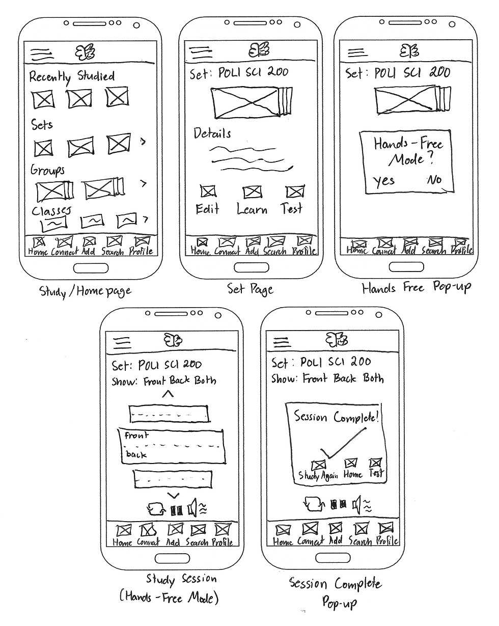
Low Fidelity Wireframes
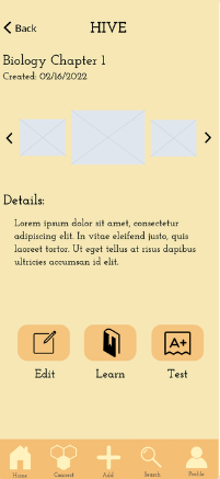
I then started digitizing the sketches immediately into a prototyping platform called Marvel. Looking back, I should not have added any visual elements before testing as it removes the focus from the main user flows. I spent a lot of time creating designs that may be potentially flawed.
Mid-Fidelity Wireframes


Conclusion

Designs don't have to be perfect the first time
Thinking of all the possible considerations at the beginning before user testing adds noise and makes it difficult to determine the key usability issues.
Build a good foundation early
Fleshing out the architecture first can save you a lot of headache later on. A bad foundation leads to faulty designs that diverge from the main user flows
Key Takeaways
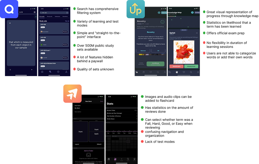
A competitive analysis was done on competing flashcard or vocabulary apps in the market to cross-compare strengths and weaknesses. I was able to see how other apps have approached in solving this problem. Leading apps like Quizlet and WordUp have vast databases of study sets and visualizations of learning. However, issues like quality of the study sets and transparency on paid vs unpaid features come into question. These issues are also echoed through the reviews of the apps in the App Store.
Competitive Analysis
Ideation
I conducted four in-person user testing sessions to validate if the designs were reflective of the user flows and app navigation. I then used Jacob Nielsen's error severity scale to grade and document where users had trouble. During the test, skipping on the foundational framework of the app came back to bite me as the core issues were surrounding the navigation and organization. Rather than clarity, the organization and terminologies used caused more confusion than clarity.
User Testing

.png)


.png)

.png)
To better understand people's behaviors on learning information, I interviewed three different people who currently or have recently needed to study a vast amount of concepts and terms. I then mapped certain quotes to doing, thinking, and feeling. All interviewees acknowledged the efficiency in flashcard apps but questioned it's validity. They also noted the fact that flashcards are purely supplementary and focus more on memorization rather than comprehension.
User Interviews
.png)
Value Proposition
Quality, comprehension, & efficiency
A flashcard app that employs a variety of learning modes, different test styles, and transparency in pre-made flashcards
Pain Point
Time wasted in verifying information
Users spend time in verifying information through their textbooks to check the pre-made flashcard's accuracy
Opportunity
Pre-made flashcard accuracy
None of the apps in the market offer a reliable means of determining the pre-made flashcard's accuracy of information
Design
With the insights gained from the user testing, I switched over to Figma and created an improved prototype. I made sure to really hone in on simplicity and made sure that that is reflected on both the navigation and the app's features. I removed features that were unnecessary, simplified the flashcard hierarchy, and added features than can give confidence to users in regards to a pre-made flashcard set's accuracy.
Improvements
Simplified flashcard organization
Changes
-
Organizing the flashcards into three different groups only caused greater confusion. To fix this, I reduced the grouping from three to one. Folders can be utilized to organize flashcard sets.
-
Created sets can also be differentiated from pre-made sets by using the navigational menu on top of the screen.
Before


After

Simplified main navigation
Changes
-
I then simplified the main navigation by removing the "Add" button. I then replaced "Connect" as it was never in the initial user flow or even a goal of my target users.
-
I renamed the icons to be more straightforward and reflective of their function.
Before

After

Flashcard reliability and accuracy
Changes
To address users' worries on flashcard reliability, I have made two changes:
-
an element that indicates the number of times a flashcard set has been saved. This suggests to the user that it is a commonly used set.
-
Users of the app can also choose between a student or a teacher in their school or program.
.png)

Test more than just memory retention
Changes
-
Organizing the flashcards into three different groups only caused greater confusion. To fix this, I reduced the grouping from three to one. Folders can be utilized to organize flashcard sets.
-
Created sets can also be differentiated from pre-made sets by using the navigational menu on top of the screen.
Before
After


.png)


Check out
Design Challenges
Check out
StudyHub
©2023 All rights reserved