_edited.jpg)

SAFE PLACE INTERNATIONAL WEBSITE
Safe Place International aids refugees identifying as LGBTQIA+ and/or single mothers through holistic development programming. We are building a high-priority social media platform for graduates of The Dream Academy, which is a 10-week course ran by SPI for LGBTQIA+ displaced persons. Specifically, our team is focused on designing the resource center feature that will live on this platform.
ROLE
Over the course of two months, I worked in a design team of seven volunteers. We frequently collaborated with the research team during the initial research phase and user interviews. Additionally, we partnered with the content team to ensure the copy aligned effectively, particularly as a resource for a minority population.
CHALLENGE
TDA graduates have difficulty finding useful, trusted, safe, and accessible resources
Currently, the thousands of TDA grads solely rely on a WhatsApp messaging group to share news, resources, and job opportunities within the community.
APPROACH & IMPACT
Designs that allow control in sharing work, seeking help, and cultivating a community.
By allowing the artist to have control over posting updates, seeking roles, looking for feedback, and interacting with the community, artists are not only able to express their project vision but also uplift the community through the impact of their creations in a method they are comfortable with.


.png)


DISCOVER
COMPETITIVE ANALYSIS + ASSUMPTION MAPPING
Similar resource centers offered a wide breadth of content and filtering but lacked infrastructure, accessibility, safety, and a sense of community
LGBTQIA+ people in Africa do not have the same LGBTQIA+ experience as people in the US. In order to start generating assumptions to drive our designs, we conducted a competitive analysis of 7 competitors and a SWOT analysis. Despite the wide breadth of content, the websites’ commonly have heavy imagery and a lack of accessibility.
We then synthesized these findings and mapped our assumptions as crucial/non-crucial vs known/unknown. This allowed the research team to generate interview questions and enabled us start ideation and brainstorming early without relying on user insights.


LGBTQIA+ Experience in US ≠ LGBTQIA Experience in Africa
USER INTERVIEWS
TDA graduates put great value on mental health, self-development, and community
During this time, we have based our early design work solely on assumptions from competitive analysis. In collaboration with the research team, we interviewed 8 TDA graduates about their aspirations and roadblocks to confirm our initial assumptions. From all 8 interviews, the key factor binding them all was their sense of community. They described it as a family and are enthusiastic about contributing to the TDA community in all its aspects: emotional help, job opportunities, self-growth, and fighting against discrimination.

100%
of the graduates described SPI as a family. About 85% emphasized the importance of emotional support.

63%
have experienced discrimination from either being LGBTQIA+, an immigrant, or both.

86%
identified as avid learners and learned to love themselves at TDA

75%
mentioned the best way to find jobs is through word-of-mouth due to the lack of documentation.
DEFINE
IDEATION SESSIONS + INITIAL SKETCHES
Designing based on initial user insights, competitive analysis, and common design patterns integral to resource centers
We used FigJam to conduct our ideation sessions. We started to sketch designs based on initial user assumptions and the competitive analysis insights and design patterns. Specifically, we made sure to include design patterns that were integral in a resource center such as descriptions, tags for categorization, immediate help CTAs, and filter and search capabilities.
As we were a team of seven designers, in order to stay aligned with design direction, we conducted a dot voting method to choose our favorite designs and features. This allowed us to rapidly wireframe and immediately present our progress and rationale to clients for feedback.


LOW-FIDELITY WIREFRAMES
We first focused on the landing page as it dictated the structure and content of the other resource pages
As the structure of the subsequent pages will be highly dependent on the landing page, we homed in on its structure and components. There was a specific focus on ease of navigation, emergency prioritization, and minimal design.

Breadcrumbs - Breadcrumbs are a constant feature across all resource pages for smooth navigation across pages

Emergency Banner -From the competitive analyses, there was a lack of obvious communication for emergency resources. If there were, they were hidden beneath several pages. This banner is always pinned to the top of the landing page for people needing help ASAP.

Main Categories - There were some instances of ambiguity on what content some categories entailed from the competitive analyses and interviews, and so we described the main categories as "I want" or "I need" statements for more clarity, and to be specific to the site's audience.
%20(1).png)
Resource Cards - We created resource cards containing text and images placed in way that clearly indicates hierarchy. The type of content is also explicitly stated on the card, as based on interviews, users want to know the type of content they are opening.
%20(3).png)
Resource Tabs - tabs help account for people who are just browsing the resource center. It adds an extra layer of more specific issues affecting a community or topic for quicker access.
%20(4).png)
See More Button - We designed for low-bandwidth constraints by limiting the amount of content being loaded in the landing page, which is a feature uncommon for many resource centers in our competitive analysis.
%20(5).png)
Suggest Topics - an issue we had trouble early on was the breadth of content and it was expected that we won't be able to encompass all the content users want to see. So, we added a "suggest topic" section for people to submit any missing topic resources. Later on, we solved this problem by changing the direction from internal-based to community-based.
DEMO FEEDBACK + FEATURE CREEP
We needed to integrate SPI's content and systems into the architecture
The client expressed their excitement for features such as the emergency banner and submit topic section. During the first two demos, the client had a lot of insights regarding their organization's operations and how they want it implemented into the platform such as the job board, current programs, and the TDA curriculum.
Obviously, this initiated a myriad of questions regarding navigation, categorization, and implemented features.


DEVELOPMENT FEASIBILITY
We ensured that our designs can be implemented
To ensure feasibility we connected with the dev team to ask questions regarding our planned solutions to the low-bandwidth considerations of our users.
-
Side-scrolling does not play a role in low-bandwidth.
-
Global search and resource specific search is feasible and non-interfering.
-
Lite mode is feasible but increases workload for dev team exponentially and cannot be implemented within timeline. Consider designing more intentionally and minimally.
INFORMATION ARCHITECTURE
During the two rounds of card sorting there was low agreement on categorization
The initial sitemap we created was only based off of competitive analysis, six TDA graduate interviews, and client feedback. And so, in collaboration with the research team we conducted a card sorting test. We received 39 responses from participants. Shown below, the dark blue boxes show a strong agreement on what content should go where. In this case, there were very few dark blue boxes meaning low agreement on categorization.
This led us to re-imagine our sitemap once again and made the following changes:
-
Removed "Community Center" and had majority of the resource center as community-driven, where users can submit resources.
-
Consolidated some topics into common categorical pairs like pairing up Housing and Asylum into one category.
-
Basic Needs was split into 4 more specific categories as it was too generic.
-
Moved emergency resources outside of the main categories and into it's own page that is quickly accessible.


DESIGN
We needed to create a reusable design layout for the resource categories. To account for users who are just casually browsing, we divided content into sections that spoke to directly to communities such as LGBTQ+ and migrant resources. As there are a lot of overlap between resources, tabs and breadcrumbs were used to smoothly transition between categories. For anything specific, users can easily search using the search bar.
A consistent issue that has been brought up in the interviews were resource viability and credibility. And so, we implemented features that allowed users to submit, engage, and even moderate the content. Adding the SPI Verified banner entails that a certain resource is safe and secure to engage with. The like and dislike counter also helps with moderation.

.png)

CATEGORY PAGES
Scenario: A TDA graduate who has recently been diagnosed with HIV wants to find information on how to cope with their disease, both physically and mentally.
CONCLUSION
CLIENT RECEPTION + IMPACT
Several more phases of development will be needed but we’re on the right track
The resource center will take several more phases of testing, iteration, and development before it goes live but we have documented several KPIs to keep track of post-launch.
-
Track percentage of user-submitted resources vs SPI-submitted resources.
-
Track engagement rate in content moderation (likes/dislikes, flagging).
-
Track average site-load times over low-bandwidth connections.
"This was just amazing! Seeing everything you've been talking about put into action and everything just falling into its place.. it is so magical and I cannot describe how happy I am after seeing the progress that each of you have made. I am deeply grateful. Thank you so much for doing this and creating this platorm for our graduates. I am sure that this is going to be lifechanging for so many people."
NEXT STEPS
Continued testing, ideation, and iteration
-
Heuristic evaluation of design work to catch inconsistencies.
-
Add existing resources of the client to be integrated into the resource center (rolling basis)
-
Conduct usability testing for user flows with greater priority on conceptual ideas such as SPI Verified and GFI application integration.
-
Desktop screens need to be created for the resource center.
-
Continue to ideate solutions to better modify designs to meet low-bandwidth and security constraints.
.png)
.png)
KEY TAKEAWAYS
Ask questions and always be flexible
-
Flexibility and communication are key, especially when working with people in different time zones. Despite the feature creep and losing one of our members, we adapted quickly and were able to develop 8 different user flows for the resource center.
-
Always ask the client what already exists early on. In this case we were not aware of the current systems and programs in place and whether or not the client foresees including this into the platform. Knowing about this helps the team integrate old systems in new and meaningful ways.
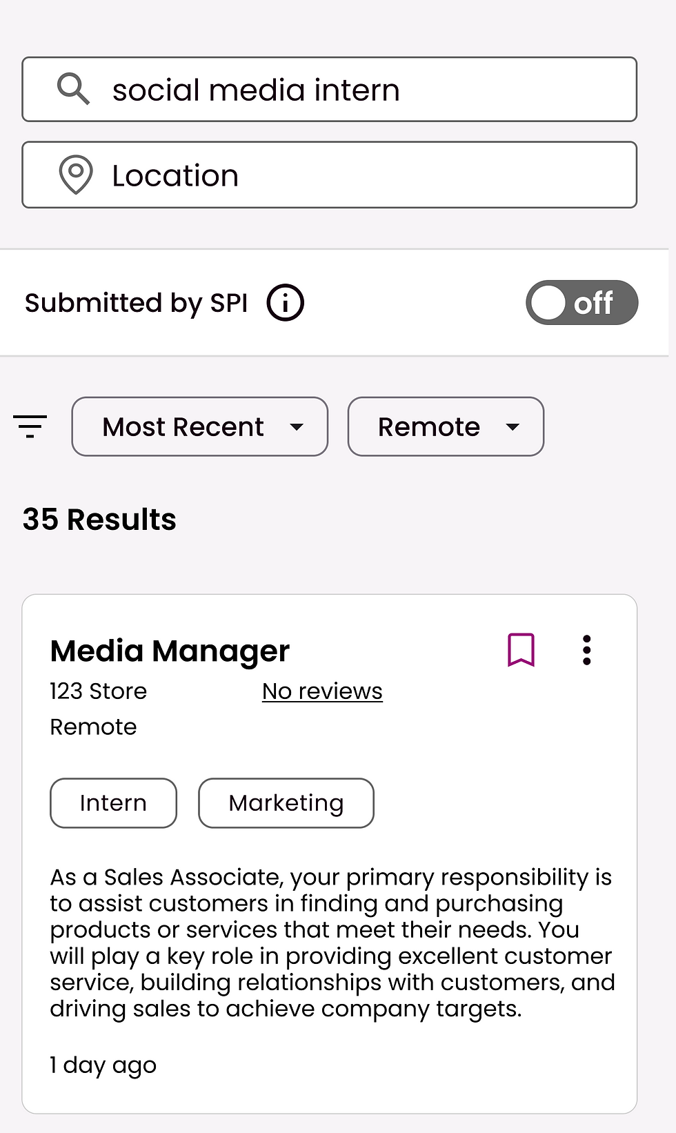
TDA graduates typically rely on job referrals or word-of-mouth for job opportunities due to safety and documentation concerns, based on the interviews. I kept the job board layout simple by creating a layout that is familiar but integrated new features.
First, by adding a banner on jobs that say “Submitted by SPI” ensure that these jobs are either internal SPI jobs or from SPI partners. I made this as a primary toggle on the job feed as it was a consistent concern. Again leveraging the community within SPI, TDA graduates can submit jobs to the job board. I also designed a robust filtering system that includes a toggle for people looking for jobs that don’t require documentation.


JOB BOARD
Scenario: An LGBTQ+ migrant from Uganda is looking for work. He does not have the proper documentation to apply for jobs online but needs income.
The clients wanted this platform to house some of the content in the TDA curriculum for graduates to use as a reference. TDA graduates were all avid learners and realized the importance of continued learning. They gravitated towards the topic of continued learning when speaking of “resources”. Thus, we designed the TDA course page to match their curriculum, post-graduation courses, and skills learning. Similar to the other pages, it has search and filter capabilities. Content can also be expanded and so users can read about the topic first before playing a video or navigating further, thus reduces the steps and keeps data usage lower.


TDA COURSE PAGE
Scenario: A TDA graduate is opening up their own business and remembered there were some marketing skills in the TDA Coursework that she wants to review but cannot remember the exact details.
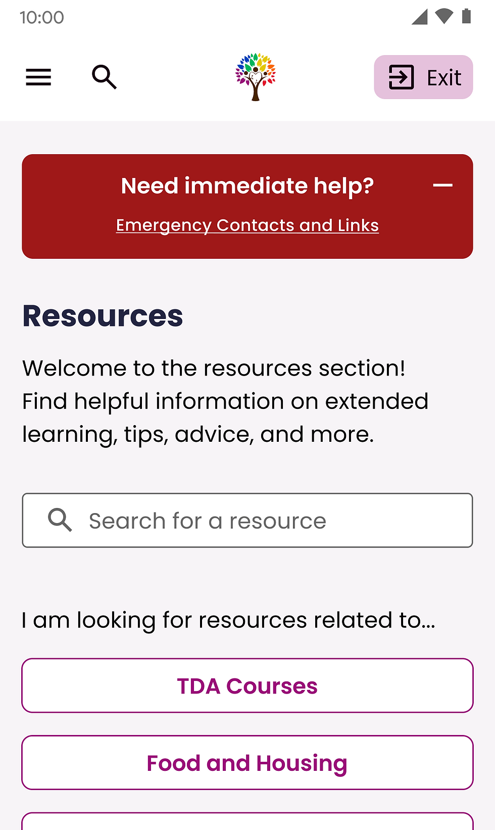
Based on the competitive analysis and user interviews, emergency contacts are typically hidden, unspecific, or even non-existent. We created a highly discoverable emergency banner at the top of the resource page. Previously, the banner could only be closed, but we realized that this needs to be a constant CTA for users to have access to at any time. Thus, we created a banner that can be minimized but always accessible.
To make our resource center action-based, we leveraged SPI’s current programs and its large network of volunteers. We created primary CTAs for the GFI application form and talking to a TDA volunteer. The navigation tab contains resources from multiple continents where there is a large density of TDA graduates. This opens a form that would currently take users off the site, but we would need development consultation in future phases to embed a form in the TDA platform itself.


EMERGENCY CONTACTS + GFI CONTACTS
Scenario: An LGBTQIA+ member in Kenya wants to report an incident of discrimination in a coffee shop but they're scared to report it to authorities.
We learned that, due to the unique challenges faced by the TDA graduate community, users were concerned how their information will be used. Anonymity is vital when reporting violence & discrimination. Thus, we considered multiple design constraints when creating the design and process.
First, is the start a report button, this leads to usage clarification and general disclaimers. We made use of color and hierarchy to indicate that this is not a police report and this will not be shared with the authorities. In the next step where incident information is entered, we added confirmation checkboxes as a final safeguard on usage understanding before submission. Finally, the confirmation page uses positive and engaging language, where members manage their reports. Throughout the process, we kept privacy & safety in mind as we clearly state how data will be used and who will see it.


